
Most difficult questions rarely have a simple ‘yes’ and ‘no’ answer. Yet, in many experiments comparing two groups—a test group that receives the treatment and a control group that receives a placebo, for example—data is often presented in the form of oversimplified bar charts.
Typically, these charts display a P value indicating whether differences between the two groups are 'statistically significant' or not. For experimental outcomes, this false dichotomy constrains interpretation to the presence or absence of an effect, instead of a more meaningful consideration of effect size, said Adam Claridge-Chang, a Principal Investigator at the Institute of Molecular and Cell Biology (IMCB).
“Significance testing using P values is almost always a lousy decision-making device, but it has become the industry standard in scientific research due to its psychological appeal. A significance test makes it seem that an objective decision has been made with mathematical certainty, but this impression is false,” he added.
To go beyond P values, Claridge-Chang recommends that scientists instead use estimation statistics, a framework that focuses on an observed effect’s magnitude. “Instead of pretending to automate decision making, statistical methods should be concerned with quantification. Decisions should be left to the scientists themselves,” says Claridge-Chang.
In a paper published in Nature Methods, Claridge-Chang and his team developed software for quickly generating estimation plots from experimental data. “Estimation plots are unique because they show the observed values alongside the effect size in a single graphic,” said Joses Ho, a co-author on the paper and the software’s lead programmer. “This helps readers quickly see the range of plausible effects, providing a complete statistical picture.”
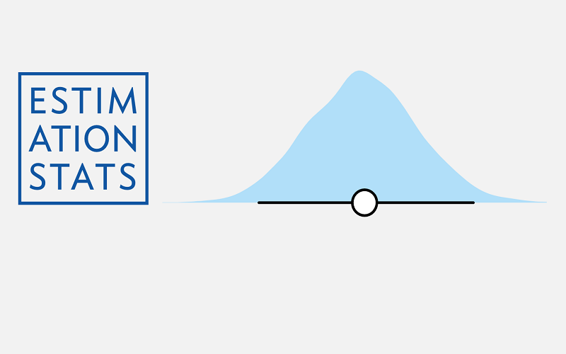
The estimation graphics software is easily accessible as open-source libraries for Matlab, Python and R-entitled DABEST (‘Data Analysis with Bootstrap-coupled Estimation’). A user-friendly web application is also available at www.estimationstats.com.
“Plotting the effect size alongside the observed values was originally proposed by statisticians in 1986. For some reason, the world wasn’t ready for this style of plot at that time,” Claridge-Chang explained. “We have improved the original plots, made them more versatile, and created software that makes it easy for scientists to use in their daily work.”
The A*STAR-affiliated researchers contributing to this research are from the Institute of Molecular and Cell Biology (IMCB).


